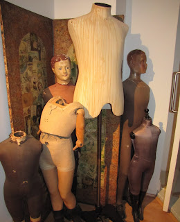
All we know that first impression is always important.First;we look at the cover page and if we like it we continue to turn the pages.That's why we always see the most attractive things on the cover page.We can consider the shop window as a cover page.It should be well designed,with the best products of the brands' and with a concept for sure.Also the lighting,materials,colors,mannequins are the most important elements to be careful on displaying.It doesn't need to be/ look expensive.Sometimes very simple detail can give very impressive look.
Unfortunately many brands don't pay attention about their shop windows.Some of them think they have a label and they don't need any,and some of them does really good ones.I took some window photos from the cities i 've been and i will add with the details of them.
mc
Elegancy of black&white
This was a shop which includes;books,home furniture and accesories in VIENNA(2009).
They had this concept for christmas and i really loved it.Main white colour represents snow,the horns of the reindeers' on the head of mannequins,chandeliers for the christmas tables and flowers are the elements of christmas and designed very elegant.
Harmony of the colors
This is United Colors of Benetton in MILAN 2009.
It was a very smart idea to put colorful sweaters on the christmas tree.Everyone knows benetton with its wide range of colors and they kept this idea for the christmas concept.Aditionally they just put red gift boxes next to the tree and with this very simple but smart idea , it worked so well.
No Stress , Be Sexy !
This is PINKO in MILAN 2009.
They just displayed boxes with the mannequins wearing colourful dresses on it.But here the main part of the concept is the text they wrote on the window."No stress,be sexy.Happy Xmas from Pinko"
No,no,no !
This is Burberry LONDON in 2010 summer.
Well,it's good quality,famous and a well known brand but they cannot just cover the windows with the pattern of their brand.Maybe some of you will think it reminds curiosity but this is one of the biggest shop they have and they had to take pain over the shop windows ! Dislike !
They kept right side windows open and left side windowes covered.It's not even compatible.
Elegancy&design
This is Louis Vuitton in LONDON in 2010 summer.
That was one of the best LV shops that i've seen.There were too many window shops and every single one designed perfectly.All the windows were including different products but attached to the same concept.
General view of the shop at Bond Street,London.
Giraffe,presenting the scarves on its neck.
2nd floor windows were more for luggages and bags.
Every glass jar presents different products of LV.
Small,simple,cosy..
This was a shop at Florence in 2008.It was not a famous brand but was a very cosy boutique placing at a narrow street.People who visited Florence will get the concept from the photos.Nothing special,nothing expensive,no concept.The only concept was the colors because of spring i think.But it was cute and created interest on me to take its photo 3 years ago :)
Design in a mess
These are some small boutiques from Nothing Hill Gate,London.I should definitely say they are really so cute and perceptible.I also entered to the shops,they don't have high quality and prices but you can find very original things ! They mostly used stickers,colors,little bit of pop art,retro and vintage.Mannequins are simple,lighting is even not available on the windows but the way they did really works to pull the people inside!
i loved the name ! i love gorgeous !


